
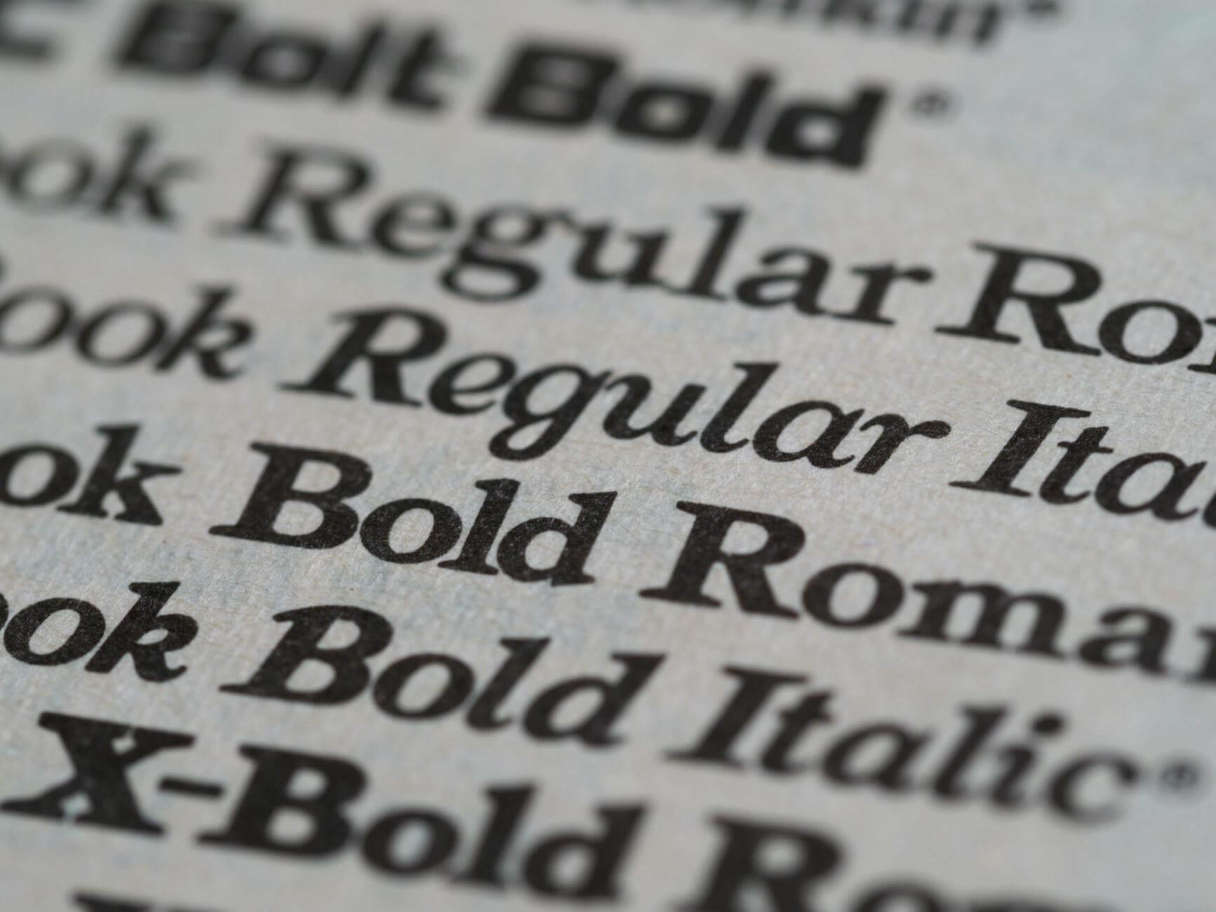
The Invisible Voice
Imagine opening a gritty, hardboiled noir novel and finding it set in Comic Sans. Or picking up a high-end, academic treatise on architecture set in a flowery, wedding-invitation script. You would immediately feel a “glitch in the matrix.” Your brain would reject the content because the visual “voice” doesn’t match the intellectual “subtext.”
In the Modern Craft, we often obsess over our Mechanical Keyboards, our 2 AM Coffee, and our AI Developmental Editors. But we rarely talk about the Typeface.
A typeface is more than just a font; it is the “clothing” your words wear. In 2026, where digital reading is the norm, being a “Digital Font-Smith” is a vital part of your Indie Brand. Your choice of typeface dictates the reading speed, the emotional weight, and the professional “authority” of your story.
Heads up: Some of the links below are affiliate links. If you buy something through them, I get a small commission at no extra cost to you. It helps keep this site running and the coffee brewing. Thanks for the support!
1. Serif vs. Sans-Serif: The Ancient Conflict
The first choice every Font-Smith makes is between the “Serif” (the little feet at the ends of the letters) and the “Sans-Serif” (the clean, footless edges).
- The Serif (Authority & Tradition): Typefaces like Caslon, Garamond, and Baskerville are the kings of the printed page. The “feet” help the eye move smoothly across long lines of text.
- The Vibe: Established, literary, trustworthy, and classic. If you want to evoke the spirit of Dickens or Hemingway, you stay in the Serif world.
- The Sans-Serif (Speed & Modernity): Typefaces like Futura, Montserrat, and Helvetica are the languages of the city. They represent the industrial, the technical, and the forward-thinking.
- The Vibe: Clean, minimalist, urban, and direct. Use these for your headings, your Direct Sales store, or a fast-paced, experimental cyberpunk novella.
2. The Caslon vs. Futura Showdown
To understand the power of subtext, let’s look at two iconic typefaces that represent opposite ends of the Urban-Indie spectrum.
Adobe Caslon Pro: The “Human” Serif
Caslon has been called the “king of types” for centuries. It’s the font that was used to print the Declaration of Independence. It is slightly irregular, warm, and incredibly readable.
- When to use it: For the body text of your novel. It creates a sense of “prestige.” It tells the reader: “This is a serious work of fiction.”
Futura: The “Mechanical” Sans
Created in 1927 based on the Bauhaus philosophy, Futura is composed of near-perfect circles, triangles, and squares. It looks like it was designed by a machine, yet it feels incredibly stylish.
- When to use it: For your book cover titles or your Newsletter headers. It suggests an urban, geometric precision. It’s the “Modern” in the Modern Craft.
3. Readability in 2026: The E-ink Frontier
As a Sovereign Author, you aren’t just designing for paper; you are designing for the reMarkable 2, the Kindle, and the smartphone.
Digital screens have different requirements than paper. On a low-resolution screen, thin serifs can “break up” and become hard to read.
- The “Digital-First” Strategy: If your audience reads mostly on mobile, consider “Slab Serifs” or modern digital serifs like Literata (designed by Google for long-form reading). They maintain the “literary” feel of a serif but are robust enough to handle pixels.

4. The Formatting Toolbox: Atticus vs. Vellum
How do you actually implement these choices? In 2026, you don’t need a professional typesetter. You need the right software.
- Vellum (The Mac Standard): If you are on a Mac, Vellum is the “magic wand” of formatting. It comes with pre-set “Styles” (like “Meridian” or “Savor”) that have already done the typography work for you. It’s sleek, fast, and very “urban.”
- Atticus (The Universal Powerhouse): For those on Windows or who want more control, Atticus is the “Scrivener of formatting.” It allows you to choose your fonts with precision and see exactly how they will look on a Kindle vs. a physical book.
[Want to make sure your perfectly formatted text is also grammatically flawless? Revisit my guide on ProWritingAid.]
My Take: The “Font-Check” Ritual
Whenever I start a new project, I don’t just write a synopsis. I choose a “Drafting Font.” For my urban noir projects, I always use iA Writer Quattro—a monospaced font that feels like a typewriter but with modern clarity.
Changing my font changes the way I write. A clean, modern font makes me write shorter, punchier sentences. A classic serif makes me more descriptive and “Dickensian.” Don’t be afraid to experiment. Your typeface is a tool—use it to “tune” your brain to the frequency of your story.
[For the ultimate guide to the “why” behind the “what,” get “Thinking with Type” by Ellen Lupton on Amazon. It is the Font-Smith’s bible.]
Final Thought: Respect the Eyes of the Reader
Typography is the ultimate act of hospitality. When you choose a typeface that is beautiful, readable, and tonally correct, you are making it easier for the reader to get lost in your world. You are removing the “friction” of the medium.
Don’t settle for the “Default” font. Be a Smith. Hammer your words into a shape that reflects the soul of your city.

Leave a Reply